The Importance of Pantone and Unboxing the 2025 color guide set
- Posted by PETER A DELUCA AKAPD
- On May 7, 2026
- 2026, pantone, vids, vidz
[00:00:10]
The video begins with an introduction to a creative project centered around the Pantone 2025 Color of the Year unboxing. The presenter notes that although the footage was recorded about a year ago, it is only being shared now due to various channel and social media commitments. The year 2025 was described as a period of reflection and returning to foundational creative work.
[00:00:50]
An experiment is introduced involving color matching using coffee and half-and-half cream, reflecting a 2025 personal resolution to avoid flavored creamers and energy drinks. The presenter explores whether this simple mixture can replicate the Pantone color, highlighting the challenge of mimicking specific, professional color standards with everyday materials. The presenter expresses a newfound respect for Pantone’s work and the “magical” quality of their colors, which go beyond basic science.
[00:01:28]
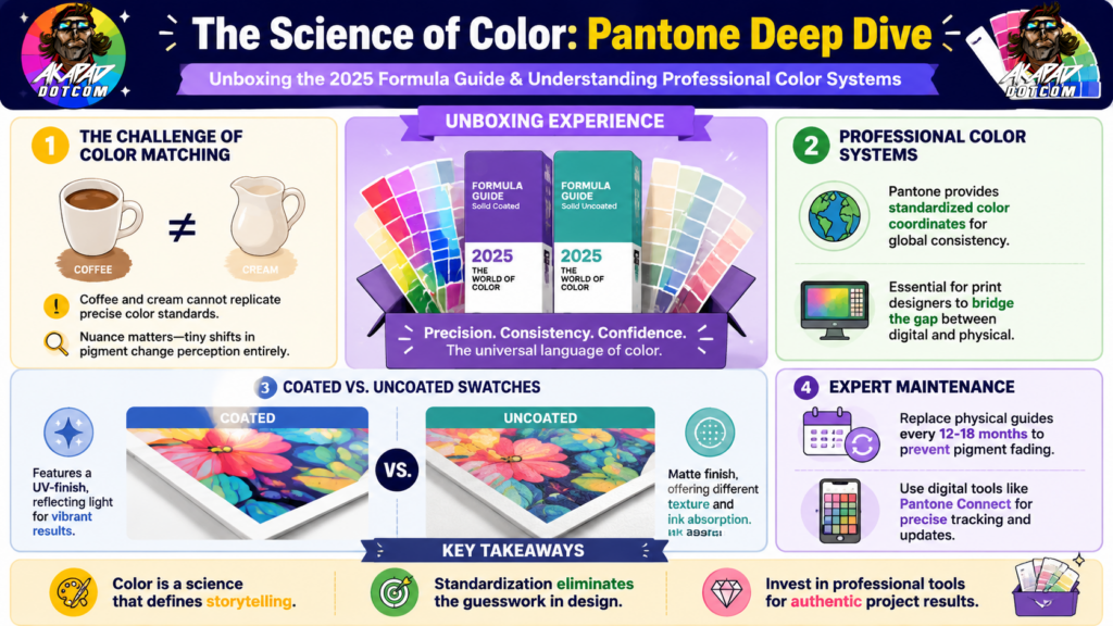
The experiment continues with attempts to match the Pantone color using solid coated and solid uncoated swatches. Despite varying the amount of cream and stirring, the color match is close but ultimately unsuccessful. This illustrates the precision and complexity involved in Pantone’s color creation and the value of their color coordinates. The presenter emphasizes that not all colors are naturally discovered; many are carefully developed by companies like Pantone and Sherwin-Williams (which collaborated with Martha Stewart on new paint colors).
[00:02:55]
The importance of color is underscored as a fundamental element of design and storytelling. The presenter references the high value of the Pantone product being unboxed—a $200+ box containing color guides. The value lies not only in the color but in the scientific and artistic expertise behind it.
[00:03:29]
The Pantone 2025 Color of the Year is identified as “171230 Mocha Mousse.” The presenter discusses the difficulty in replicating this color accurately with common substances like coffee and cream, noting subtle purple undertones that differentiate it from a simple coffee-and-cream mix. This introduces a brief discussion of color theory, specifically the use of a color wheel to understand complementary and secondary colors, but acknowledges that even the theory cannot fully replicate Pantone’s precise hues.
[00:04:50]
Comparisons are made between various commercial colors to illustrate the nuance in color perception:
- 7-Eleven Supra orange is described as closer to apricot with red undertones rather than a pure orange.
- McLaren orange, associated with the F1 constructor’s championship, is noted as distinctly different from the 7-Eleven orange, highlighting how color branding can vary dramatically even within similar color families.
This comparison reinforces the presenter’s view of color as a “visual storyteller” and a critical tool for brand identity and design.
[00:06:01]
The video proceeds to the unboxing of the Pantone Formula Guide 2025 Color of the Year Limited Edition. The presenter expresses excitement about handling the guide, noting it is the first time they have opened one personally rather than receiving leftover swatches. The guide is described as visually and tactically impressive, featuring a textured finish that is not matte but highly appealing.
[00:06:48]
The guide includes two types of swatches:
- Solid Coated (UV coated or glossy finish)
- Solid Uncoated (matte finish)
The distinction is critical for color matching in different print and product applications. The presenter emphasizes the importance of replacing the guide every 12 to 18 months due to color fading, reinforcing the professional use and maintenance of Pantone materials.
[00:07:38]
The unboxing reveals additional components, including a message from the Executive Director of the Pantone Institute and a detailed history of the Pantone Color of the Year program, which has been ongoing for 25 years. This historical context adds to the significance and credibility of the Pantone color system.
[00:08:25]
Further details about the Pantone guide include:
- Total of 2,390 colors in the system.
- Information on base inks.
- Availability of various swatch types, such as plastic swatches for product designers and mix guides.
- Uniformity and consistency maintained by the company, which is critical for print design and manufacturing.
The presenter, who works heavily in print design, shares that they previously relied on informal or “black market” methods to identify Pantone colors but now appreciates the official and systematic approach.
[00:09:11]
The guide also contains:
- Printing notes.
- Paper stock details.
- Color matching and warranty information.
- Appendices with additional technical information.
This comprehensive documentation supports professional use and ensures accuracy in color reproduction.
[00:10:00]
The video introduces the Pantone Connect app, which costs approximately $30 for the app or $90 for an annual subscription. The app provides digital access to Pantone colors and tools, including early notifications about new color releases and features like color tracers. The presenter mentions potential discounts upon renewal and emphasizes the value of digital tools alongside physical guides.
[00:10:35]
A comparison between coated vs. uncoated swatch paper quality is discussed. The uncoated swatches feel more matte and have a different paper thickness, which affects color perception and stacking height. This physical difference impacts practical applications such as printing and product design.
[00:11:18]
In conclusion, the presenter encourages viewers to explore and deepen their expertise in color science and design, emphasizing that there is always more to learn. The video closes with the presenter preparing to enjoy a coffee while reflecting on the experience.
Key Insights
- Pantone’s 2025 Color of the Year is “171230 Mocha Mousse,” a complex color difficult to replicate with everyday materials.
- There is a clear distinction between solid coated (UV coated) and solid uncoated (matte) swatches, which are critical for accurate color matching.
- The Pantone Formula Guide is a professional tool, updated regularly due to fading, and essential for designers working in print and product development.
- Color is a fundamental storytelling and branding element, with subtle differences significantly impacting perception.
- The Pantone Connect app complements physical guides by providing digital tools and updates.
- Pantone has a 25-year history of defining Color of the Year, reflecting its long-term influence on design trends.
- The physical and tactile qualities of Pantone materials are as important as the colors themselves in professional contexts.
Quantitative Data Table
| Item | Details |
|---|---|
| Pantone Color of the Year | 171230 Mocha Mousse |
| Total Colors in Pantone System | 2,390 |
| Pantone Guide Replacement Interval | 12 to 18 months |
| Pantone Connect App Cost | $30 (app only), $90 (annual) |
| Years of Pantone Color of the Year | 25 years |
Summary Timeline
| Timestamp | Event Description |
|---|---|
| 00:00:10 | Introduction to Pantone 2025 Color of the Year unboxing |
| 00:00:50 | Experiment attempting to match color with coffee & cream |
| 00:01:28 | Discussion of solid coated vs. uncoated swatches |
| 00:02:55 | Importance of color and value of Pantone boxed guide |
| 00:03:29 | Explanation of “Mocha Mousse” color and color theory |
| 00:04:50 | Comparison of commercial oranges (7-Eleven vs. McLaren) |
| 00:06:01 | Unboxing Pantone Formula Guide 2025 Limited Edition |
| 00:06:48 | Explanation of coated/uncoated swatches |
| 00:07:38 | History of Pantone Color of the Year program (25 years) |
| 00:08:25 | Overview of Pantone system’s color range and documentation |
| 00:10:00 | Introduction to Pantone Connect app and subscription |
| 00:10:35 | Paper quality differences between coated and uncoated |
| 00:11:18 | Final remarks encouraging deeper exploration of color |
Keywords
- Pantone
- Color of the Year 2025
- Mocha Mousse (171230)
- Solid Coated vs. Solid Uncoated
- Color Theory
- Print Design
- Pantone Formula Guide
- Pantone Connect App
- Color Matching
- Visual Storytelling
This summary captures the detailed exploration of the Pantone 2025 Color of the Year, the technical aspects of Pantone’s professional tools, and the experiential insights of the presenter engaging deeply with the color system.
00:00:10
Let’s rotate rotating the whole camera. Aka Pers, welcome back. So, we’re doing something, right? Like these are some of the creative videos I’ve been talking about and teasing. This is a uh Payton Tone 2025 color of the year unboxing. Here’s the crazy thing. Uh about a year went by since I recorded this video and right now. And the reason for that is is we we had a lot of things to do for the channel and throughout all the social media. Uh, a lot of 2025, the, you know, this calendar year was really about me
00:00:50
getting back to the drawing table. And yeah, I think I think we’re there. I wanted to open this video with a little bit of a of a cool experiment. See, I spent my life uh ignoring these uh kind of buying knockoffs. And I want to say like this deep in my professional career. Uh, I really do see the value of this company and I absolutely love Pain Tone. I I what they do to me is it’s magical. You know, it’s beyond science. So, I thought we would try and mix some cuz, you know, we don’t do the flavored
00:01:28
coffee creamers anymore. I just do half and half. That was one of the 2025 resolutions. No energy drinks, no flavored half and half. Can we get this colored coffee with some half and half? Maybe a little bit of help from a spoon here. Can we get it to match? Like even like the color from the mug, right? Like that’s this is the fun of these colors of these coordinates. I think this is the value that they add. Let’s see. H Whoa. We are close for like a single pour. All right. Not quite there. And and I
00:02:14
kind of So, so here too, we we have uh solid coated and then we have uh solid uncoded. If if you guys are familiar uh I further in the video, we get a little bit of uh detail into the difference of the two. Not quite there, right? I would even say like this here, right? like a little bit more of a purple is shading it. But let’s just do and yeah, it’s not like we can control the drops, right? Let’s see. Can we get a little bit darker? It does look right. I mean, it’s not there. It’s not
00:02:55
even close. And that’s that’s the whole point when it comes to your colors, your coordinates, and why they’re valuable. Because here’s the crazy thing. Not every single color is discovered by these guys, right? like they’re they’re constantly and this is a little bit of a of like Sherman Williams too that did something very similar with like Marthur Stewart where Marthur Stewart came up with like 200 new colors for house paint or whatever. But guys, color means everything.
00:03:29
That’s a $200 plus box of color here. Uh before we before we crack that open, I I I brought some like other examples, let let’s just cycle back to what we were doing with the coffee. So the color of the year 1 171230 mocha moose. And you guys can see it’s it’s tough, right? Like what is I made like if we put like a little bit more light on it, right? Like what is the difference now? Cuz it’s clearly not coffee and cream. Coffee and cream cannot recreate this color. I want to
00:04:12
say just to my naked eye, this has a little bit more purple in it. Yeah. See, and and and this is where like color theory becomes almost like a color science. And for this drawing table, like I I always had one of these ever since ever since I was young. I always had a color wheel like right in like some it’s off camera a lot, but it’s right in in like earshot, eyes shot, and you just get your complimentary colors, right? You you have your like secondaries here. You have your additional shades and you’re
00:04:50
like, “Okay, well, this is this is what we can do. This is how you do it.” But it’s it’s not there. Like, and I guess this is where there’s a little bit of an existential crisis because we get the 7-Eleven Supra. You see the 7-Eleven orange? I always like the 7, but it’s not really orange. There’s like it’s a little bit more apricot. There’s more red in it. We have the McLaren. Uh maybe potentially. I know they were going to win the the constructor’s championship
00:05:23
easily. Uh, you know, maybe they might they might get one, two, and three this year. We don’t know. There’s only a couple races left, but see their their orange. I mean, it’s it’s a separate world compared to that 7-Eleven orange. And I think as as a visual like storyteller, as a visual person, you got it’s important. Formula guide 2025 color of the year limited edition. I had to get the limited edition one. And let me like these are I never opened one of these in my entire life. And the swatches that I
00:06:01
had were always given to me. I always got people uh people’s leftover swatches. The idea is you purchase these. Wow, what a nice box. You purchase these uh mostly like every other year, but predominantly you want to buy a new one of these every single year. And the reason for that is there’s fading. But this box, it’s it’s not like matte finished, but it has a addicting texture. Wow. Okay. Yeah. And we see here. So, just quick observation. Why does one of the swatches have the spacer? This cardboard
00:06:48
spacer. And oh, we can even see that mocha mousse is not is not even close to a cardboard brown. It’s because and I’m going to guess that this side is coated. See? Yeah. Replace your guide every 12 to 18 months. This is Oh, this is solid uncoded. I was wrong. And then here we go. Solid coated. So we we would call this like matte finished or UV coated. And there is a absolute separation of if you’re getting something printed that’s UVcoated versus uh matte finished or coated or uncodated. But yeah, here here they are.
00:07:38
Let’s just I’m like this. This is one of the sing singular most expensive things I ever handled on this channel. Oh my god. So cool. Beyond cool. You go. We have some Oh, yeah. That’s like a thin piece of paper. So, we have a word from the executive director director of the Payton Institute. And there’s the color of the year right there as its own uh tile right as its own card. History of pain tone color of the year. Wow. I didn’t even realize it goes all the way. Wow. They’ve been
00:08:25
doing this for 25 years. Holy crap. Register now for great products. This will be registered later. Later for sure. Pain tone guide. solid coated some directions 2,390 total colors base inks information on that. So there’s a variety of these. There’s plastic swatches for product designers. There’s there’s mix guides. Everything is uniformed through this company. And I do a lot I I do a heavy amount of print design. So, it’s it’s important. I I would I would always have ways to find out a
00:09:11
pain tone color. I kind of had, you know, like black market ways of doing it, but not anymore. Printing notes, paper, stock, little color matching, bulk carry and warranty, notices, all the trade. And then here we go. We go right into the swatches with a appendencies in the back. What? H super cool. And you guys can guess this will probably be a little bit more of the same probably with information regarding the uncoded. So maybe I’m wrong, right? Like maybe I I want to say maybe these are printed as
00:10:00
if they had UV coating, but they’re not UV coated. So again, like there’s a little bit of education on on my end. Here we go with all of this Payton Tone Connect. This is that that $30 app. Now, I will say this. You can get the app for like $90 for the entire year. No questions asked. Uh that’s what I pay for. No, look, be the first to know about the color tracers or the paint color. Okay. So maybe, yeah, maybe I’ll I can even get like a discount next year probably when I renew. And we have a lot of the same
00:10:35
info here. So this like different paper quality. Yeah, a,000% uncodated feels a lot more like matte. So I think the paper quality is different. That’s why there’s uh you know, they stack differently. There’s a different height difference. So this is yeah I would say this is UV for sure just based on the paper quality. Yeah guys uh never never be afraid to really explore and get deeper into your expertise. You can never get deep enough. That’s what she said. So let’s wrap this up. Let’s grab
00:11:18
our coffee. Let’s have a final word. Let’s go.
AKAPAD is a versatile thinker known across Philadelphia, Europe, and even in the vast Multiverse as The Electic One. By day, he excels as an IT Mastermind, assisting individuals, both big and small, with a wide range of simple and complex solutions. In contrast, he is also a talented illustrator, a passionate comic book enthusiast, a creative content creator, and an active live streamer. Additionally, his podcast, “AKAPAD The Film Buff Podcast,” boasts an impressive catalog of over 500 episodes available on nearly every major platform.