How reading led me to discover one of the greatest graphic designers of our time, Katy Homans
- Posted by PETER A DELUCA AKAPD
- On March 15, 2026
- 2026, article, graphic design article
Before we get into this, let me let you inside a regular practice of mine. To understand something I like being in front of it for a long period. You can imagine this practice of mine is in direct conflict when I visit a museum—this is why upon leaving any museum or showing, in fact, I immediately want to return.
I write this while sitting in a Philadelphia Center City Paris Baguette. I’ve spent some time in here, maybe too much time, but I’ve been in front of everything here. I can confidently speak on the harmony of this one’s design, layout, art (yes, they have a fantastic graphic design minimalistic mural) that this one is one of the best layouts in the entire world: simple, there, effective, natural. I can say this because I’ve spent a lot of time in a lot of Paris Baguettes.
When I first became aware of paperback reprint design it was before I committed to design harmony (right, isn’t this very website harmonious in design? Crap, I hope so). There was a series of books from a particular author that triggered me—they were all uniformed, they all matched. What seemed silly at the time because, well, hell, so many of the stories are different. Simple question: how can different stories, some drastically different, all share the same design?
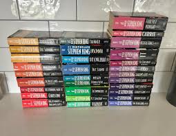
The design of this series was spawned out of the 90s and is now known as the Stephen King Signet series, and a collector culture has emerged treating each design like Pokémon—you gotta catch ’em all. When this is the case, I hope the collectors are at least reading these books in one form or another. This is an issue I have with the comic book collecting community.
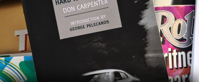
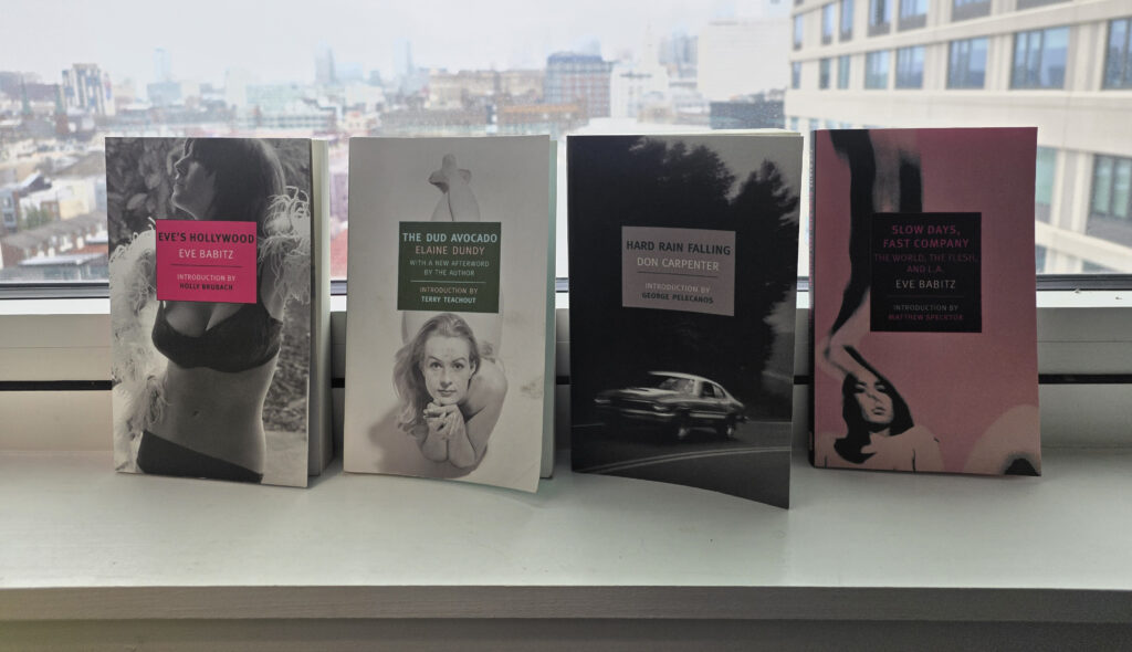
Fast-forward: it has not been since earlier this week while reading Hard Rain Falling that I realized how much the cover design is in my head while reading this book. Then I recalled what pulled me in to read the back cover of The Dud Avocado. Then I recalled the display my local Barnes & Noble had last summer (sorry, wish I had a picture) where I would just stare at it, thinking about the picture that was chosen to be on the covers. And the cover for a Jack Kerouac book stood out in my mind: a woman with a cat leaning on a car. Gosh, what could this story be about? I would have to read that too.
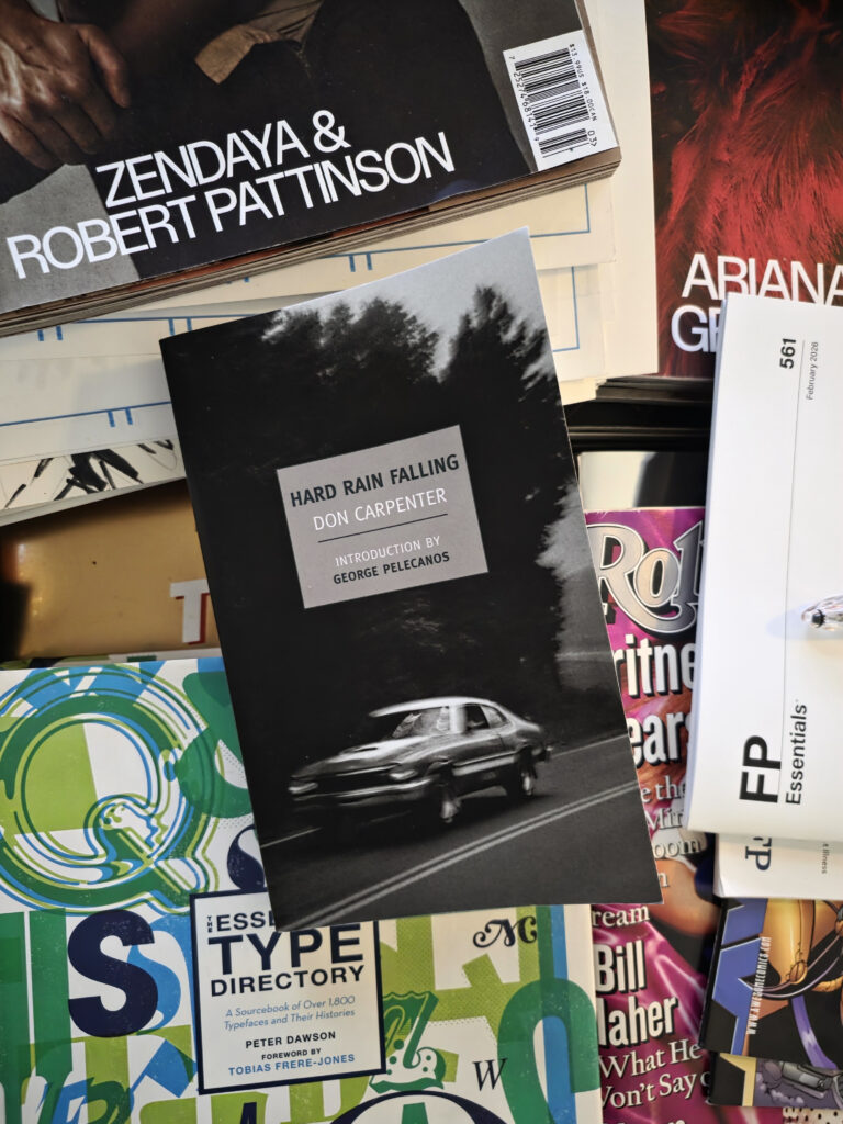
Hard Rain Falling has been in front of my face on my living room piano-finished coffee table book stack for over a week, maybe ten days. And as the cover kept catching my eye I realized something irregular: the type, the critical information we all need to know about this book—title, author, and so forth—was in a short rectangle and floating somewhat above the equator, oddly sized, positioned, and blocking the image. This then hit me like a ton of un-scooped kitty litter: “Why the hell, how the hell does this work?”
What a bizarre thing—it should not work, so much so it made me mad because I can’t explain it. Reader, whenever this revelation hits you it means you are on to something.
Randomly a question came to me through the fog of my day: who the hell designed that cover series? Who’s behind it? Is it too generic to be traced to any credit? And if so, if we do not know who created this design, am I the only one worried about it? Yes, I understand the internet is big, but it’s not that big.
Fortunately I discovered this genius and her name is Katy Homans. She’s the designer who created the iconic look for the NYRB Classics series from New York Review Books—the imprint responsible for reprinting Hard Rain Falling (in 2009, rescuing it from obscurity) and so many other neglected gems like The Dud Avocado and various Kerouac reissues that pull you in with those perfectly chosen, often surprising images. For over 15 years and hundreds of titles (around 425 before they refreshed the formula), Homans crafted this clean, modern, instantly recognizable style: those solid-colored spines that make the shelf sing, the deliberate placement of the text box (often interrupting the artwork in ways that somehow make it more compelling), and the overall harmony that rewards staring—like the Paris Baguette mural or your coffee table stack. It’s no accident that the design feels both uniform and endlessly varied; it’s built to draw you in and keep you there, just as you’ve been doing.
AKAPAD is a versatile thinker known across Philadelphia, Europe, and even in the vast Multiverse as The Electic One. By day, he excels as an IT Mastermind, assisting individuals, both big and small, with a wide range of simple and complex solutions. In contrast, he is also a talented illustrator, a passionate comic book enthusiast, a creative content creator, and an active live streamer. Additionally, his podcast, “AKAPAD The Film Buff Podcast,” boasts an impressive catalog of over 500 episodes available on nearly every major platform.